From the very beginning of the Jisc user experience and design project we knew that we didn’t want our pattern library to be just another framework. Bootstrap is widely used across our business and it’s fantastic for rapid development, but by its very nature it’s completely open to individuals interpretation of how to apply it. What we were creating had to add more value to the business than just another bootstrap.
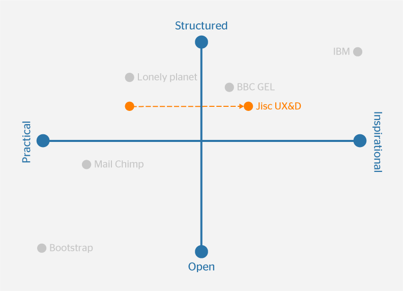
At the start of this project CX partners undertook an expert review of high profile pattern libraries, style guides and frameworks. They plotted these on a perceptual map, and asked us to do the same for our vision of what we were creating. There was unanimous agreement that during the rollout phase of the project it needed to be more practical and structured, but as it matured and more sites starting using it that it should become more inspirational whilst still retaining its structure.

Knowing this structure was essential to the library, we identified two key types of documentation required for each pattern: how to use and how to implement. Bootstrap deals with the the how to implement part, but not how to use. If we wanted to create this balance of structure and practicality, whilst adding value to the business we needed to ensure we had not only the hard (technical implementation) guidance about a pattern, but the softer (UX and design rational) guidance.
I recently came across an article on UX Pin called How to Document Your Designs for Easier Reuse. This peaked my interests because the day before I’d picked up on a comment from a 3rd party back-end developer that was using the pattern library as a reference for how to solve a design problem about field labels. They weren’t actually using our CDN or our specific forms patterns, they were just using our library as a reference point for how solve a UI design problem – without asking a designer!
This made me think about what problem we’re actually solving with our pattern guidance. My belief is that it’s not how do I use this specific pattern, it’s how do I solve this UI design problem. Which is where I found the aforementioned article useful. Firstly it validated our logic for calling all the ‘things’ in our library ‘patterns’. They’re patterns because they are recurring solutions to common UI design problems.
“Patterns make websites and apps more learnable for users. Since they’ve already used the pattern on other sites, users can easily learn how to interact with them on yours.”
Secondly it lists the documentation that you will require to make your patterns reusable:
- Name – The name of the pattern so you can all recognise it and find it within your patterns
- Description – A short summary of its purpose
- Context of use – Where and when you’re most likely to find the pattern put to use (a search box would appear on most pages of a content site, for example, perhaps at the top of the page)
- Where used – This is a list of links to examples of it in action on a live website or app
- How it works – A description of the actions a user takes and what happens as a result
We already use many of these themes in our how to use this pattern documentation, but I liked the explicit nature of these headings. It shouldn’t matter whether someone is using our library’s HTML, CSS and JS or that of Bootstrap or Foundation. Our documentation should be framework agnostic wherever possible.
There will always be examples where we need explicit guidance for a UI pattern. We have some patterns that signature to Jisc with a specific context of use, but we need to ensure that our documentation is relevant and reusable even when abstracted from the framework that accompanies it. As we add new patterns and continue the development of our library this is the key focus for all our guidance.

2 replies on “Documenting UI design patterns”
Thank you for visiting Hi-Lo Industrial Trucks Co. Since 1946, Hi-Lo Industrial Trucks has been serving the needs of southeastern Michigan businesses as a small business continuously striving to serve the needs of a growing community. We Offer Forklift Service, Fork Lift Repairs, Forklift Rental, Sales & Parts to cities around Detroit (MI), including: Detroit, Warren, Sterling Heights, Ann Arbor, Livonia, Dearborn, Canton, Westland, Troy, Farmington Hills, Southfield, Waterford, Rochester Hills, Pontiac, Taylor, Royal Oak, Dearborn Heights, Novi, Redford, Roseville, Lincoln Park, Eastpointe, Madison Heights, Southgate, Garden City, Inkster, Oak Park, Allen Park, Wyandotte, Romulus, Ypsilanti, Hamtramck, Ferndale, Monroe, Auburn Hills, Trenton, Birmingham, Wayne, Hazel Park, Mount Clemens, Grosse Pointe Woods, Highland Park, Berkley, Fraser, Wixom, Harper Woods, Woodhaven, Riverview, Clawson, Grosse Pointe Park, Rochester, New Baltimore, South Lyon, Grosse Ile, Ecorse, Melvindale, Beverly Hills, Farmington, Grosse Pointe Farms, River Rouge.
Knowing this structure was essential to the library, we identified two key types of documentation required for each pattern: how to use and how to implement.
Bootstrap deals with the the how to implement part, but not how to use. If we wanted to create this balance of structure and practicality, whilst adding value to the business we needed to ensure we had not only the hard technical implementation guidance about a pattern, but the softer guidance.
I recently came across an article on UX Pin called How to Document Your Designs for Easier Reuse.
This peaked my interests because the day before I’d picked up on a comment from a 3rd party back-end developer that was using the pattern library as a reference for how to solve a design problem about field labels.
They weren’t actually using our CDN or our specific forms patterns, they were just using our library as a reference point for how solve a UI design problem without asking a designer.