The new site has to be customer focused, accessible and helpful. If we achieve this a lot will be down to the site’s information architecture – how we organised our content and what labels (eg. ‘about us’) we used to describe it.
After an exploratory set of user and stakeholder interviews we came up with some big aims:
- The visitor shouldn’t need to know our brands, how we’re structured, or how we’re funded. They should just be able to access the help they need.
- the main menu items should be a snapshot of the areas in which we can assist
- as you move through the site the words we use to label our content should be accessible for all, not just those in Jisc or higher education
- the (sometimes confusing and intimidating) in-development work should be kept away from the ready-to-use guidance
- Many of the people we already support only know a small part of Jisc. We want to make sure the new site showed them how else we could help.
- The structure should be stable, and able to adapt as the new Jisc comes into focus.
From these discussions we had a first attempt at organising and describing our content. The next step was then to test our structure and labels with real users.
User testing
We ran 12 face-to-face and remote testing sessions with volunteers from higher education, further education and the skills sector. We…
- asked them to talk about how they use our services
- showed them labels and asked them to describe what might sit beneath them
- showed them content and asked them to come up with a suitable label
- created basic mock-ups of navigation and asked them to complete tasks
(eg. ‘Where would you go to find help on mapping’)
We certainly didn’t get it right first time around, but we adapted. If a label wasn’t scoring well then we made sure we included alternatives for the next participant. Alternative labels often came from listening to the language our participants used. Eventually we came to a stable, and apparently understandable, site structure.
Jargon
It’s amazing how hard jargon can be to spot when you’re surrounded by it. Two terms we thought would be pretty robust were ‘Content’ and ‘Infrastructure’. They’re common terms for big areas of our work. They utterly threw our testers.
Content had participants thinking of site contents, while Infrastructure was thought to house details of the site. By adding ‘Digital’ to content it suddenly made sense. Infrastructure had to become Network & IT services before all our testers got it.
In some cases the final labels may not seem to precisely describe what sits beneath it, but we found the harder we tried to make a label describe all we do perfectly, the less it meant to anyone. The labels we eventually settled on were chosen because they were accurate enough that our participants could anticipate what sat beneath them.
The structure
At the top level of the site we have our snapshot of what Jisc does. We’ve also kept our ‘in development’ work away from our ready for market content by housing it in an research and development section.
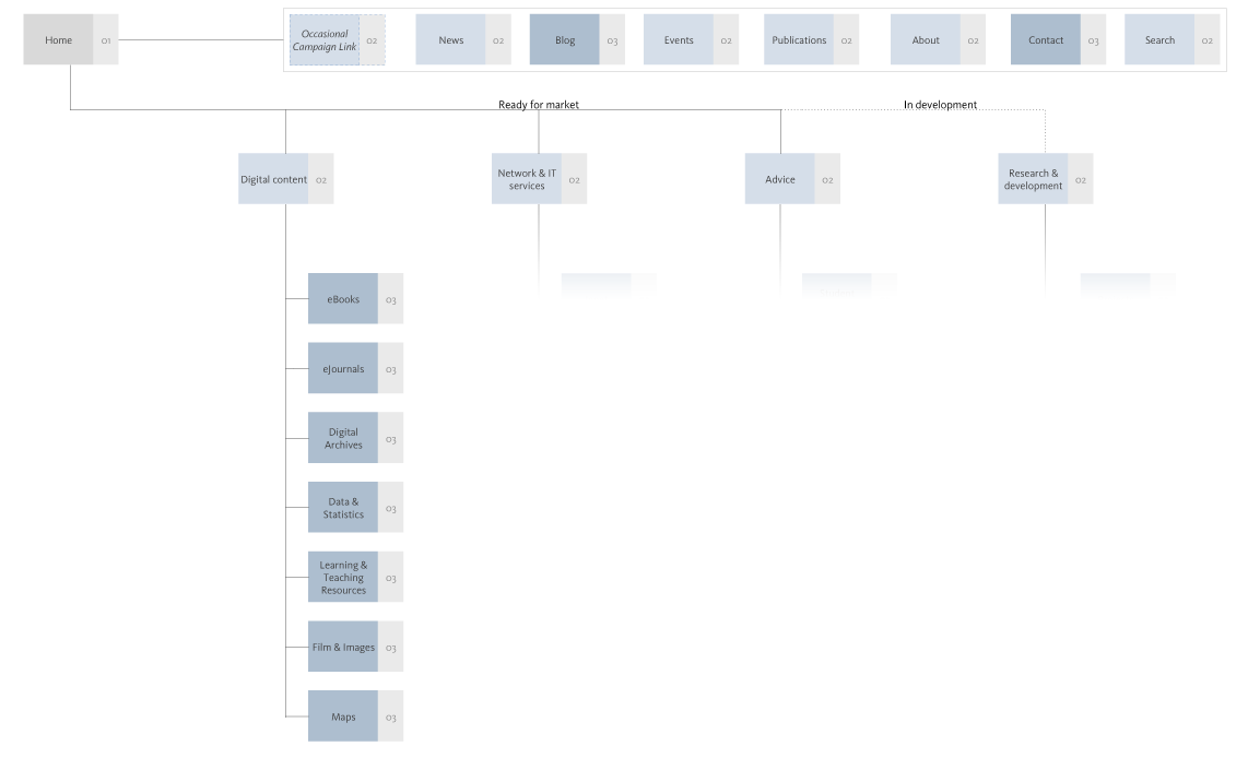
Beneath these top level areas the content is organised by theme, so you don’t need to know brand names. For example, beneath Digital content we have…
- eBooks
- eJournals
- Digital archives
- Data & statistics
- Learning & teaching resources
- Film & images
- Maps
We will also be providing shortcuts for those who want to jump straight to a brand (eg. Jisc Collections) and don’t need to be taken, step by step, through our offer.
Stable-ish
There is one label that will likely change and that’s Research and Development. To make the website project feasible we split it into two:
- Phase one is looking at the ready for market help and support.
- Phase two looks at how we describe the content currently housed in Research and Development.
As what sits in Research and Development is likely to change, so it makes sense that we revisit the label at that time.
Overall however, we feel confident we’ve created a stable structure that meets our aims. It provides an immediate overview of how we can help, it’s accessible, the in-development work is separated and clearly identified, and the whole thing is based on what our users want, rather than how we’re organised.
3 replies on “Arranging the new Jisc website”
Really interesting Rich – I also look forward to reading about you deal with the R&D section (which has been the bane of many a Jisc web managers life!)
I liked what you said here “the harder we tried to make a label describe all we do perfectly, the less it meant to anyone.” So very true and a hard battle to win with some people as well.
Amusingly I think the navigation now closely resembles that which I first inherited at Jisc many, many moons ago 🙂
Thanks Matt,
Yep – it seemed wise to not rush the R&D section!
We actually started the R&D interviews recently and we’ll (eventually) be posting about it on here. Though it might be quicker to find us in the Eldon (when your amazing dryathlon is over of course!).
As for the navigation, that sounds positive – a bit of convergent evolution suggests we might be on the right track 🙂
[…] gathered that we’re going through a complete redesign of the Jisc website. When I arrived the IA had just about been agreed and I jumped straight into the thick of wireframing and design workshops […]