With the research done, principles in place and content arranged, it was time to design the new Jisc website.
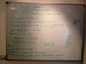
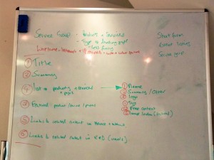
From the whiteboards …
 First and foremost, we wanted to put ourselves in our users’ shoes. What do they need? What might engage them, help them or frustrate them as they navigate our site? Armed with the insights we gleaned from the research phase, we looked at content types in turn, such as a service or an event, and tried to work out what our users might need or want.
The business is needy too. It wants to promote stuff, get key messages across and save time and money. We kept a keen eye out for when business and customer needs aligned, as these are obviously critical requirements.
We also took time to consider any content or features that might delight our users. We don’t want to waste effort on gimmicks but it is these little flourishes of utility and loveliness that elevate a website above others.
 Armed with our list of needs, we decided what content was required on a page and its priority. We took a fair old time over this. As the new design will be responsive and scale to the size of the screen it is being viewed on (we’ll write a post about this separately), prioritisation is key as it will dictate the flow of content on small screens, typically mobiles.
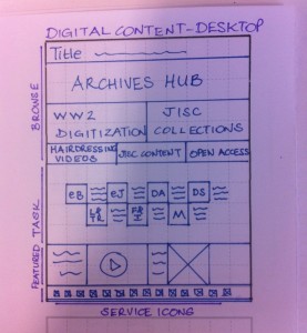
…to the notepads
 We sketched initial solutions to communicate and sense-check ideas. Sketches are great. Quick and disposable, they stop us getting too attached to ideas or putting too much effort into production when we might be barking up the wrong tree entirely.
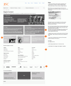
…to the computer
 When we deemed a sketch, or a combination of sketches, to have legs, we turned them into wireframes. We are still only concerned with the layout of content and functionality at this stage but they are starting to look and feel more like web pages and are good bases for consultation with people outside of the project team. Crucially, they won’t distract us or others with pretty pictures (as everyone has an opinion on visual design).
…to the top-of-the-range Mac
The final stage was visual design. Guided by Jisc’s new brand, we wanted to create a design that elegantly framed our content but got out of its way, that made reading on our site a pleasure and was flexible enough to support a wide range of content. It also had to work in a responsive framework, so when a page was reflowed for a small screen, the design was transformed but intact. The creative team at cxpartners did a great job (aided by our nitpicky and abundant feedback of course) and have produced a visual design that we’re very excited about.
What? You were expecting a picture? Sorry, no spoilers here.
Design by team (not committee)
The biggest learning for me was the effectiveness of a collaborative design process that involves all parties: client, UXers, designers and developers. We sat in a lot of workshops, which was labour intensive, but provided the focus and momentum we needed to produce some great work. I found that lazy thinking was outed quickly and the (mostly!) friendly challenge of the workshops forced us all, client and suppliers, to up our game.
It was incredibly valuable getting the developers involved early. They were able to flag up problematic requirements or suggest using existing functionality that would give us 80% of what we wanted for 80% less effort. In the past, I have commissioned UX work, visual designs and development as distinct pieces of work, where outputs are chucked over the fence to the next stage. However, these stages are not rigid and design elements have got lost in translation as they moved through the process. I really saw the difference with UXers talking to designers talking to developers throughout. Design is a team task where leading players wax and wane, not successive pieces of work where one party after another bows out (and never speaks to another again).

One reply on “Designing the Jisc website”
Oh Ben you big tease….