Ever heard comments that have gone something like…
“The sort of tasks that users are performing are too complicated for mobile”
“Analytics show our primary audience is desktop”
“Users only want a desktop site”
When desktop use vastly outweighs mobile it seems obvious to prioritise that as the primary medium. And following a strategy that puts mobile design first seems utter madness.
Mobile isn’t an edge case any more.
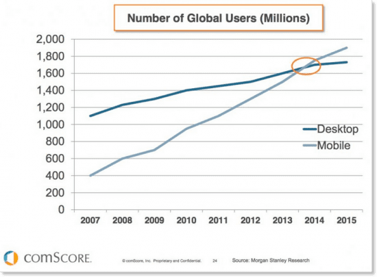
It’s well documented that mobile web browsing is rapidly on the rise – in 2014 it overtook desktop browsing – and continues to grow rapidly. The concepts of graceful degradation and progressive enhancement have been discussed at length online and there are advocates of both approaches. On the face of things they seem fairly equal… As long as you can get the information or perform the tasks you want to do on your chosen device, who cares.
When designing for a desktop first you logically use the screen real estate that’s available to you. The problem comes when you try and squeeze (or gracefully degrade) your awesome desktop UI into a smaller viewport. In the most part you’ll end up with either a watered down version of your desktop site or something that is frustratingly unusable on mobile. Either way it will no longer be awesome.
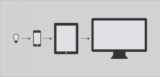
Mobile first is a design strategy, not a primary use case
When i hear comments like the ones mentioned earlier my instinct is to dig deeper.
Why are the tasks too complicated?
Why does your analytics show higher use for desktop?
Why do users say they want desktop only?
Without boiling down the issues it becomes self fulfilling prophecy.
Mobile first is hard
Taking a mobile first approach means you’re met with constraints straight from the word go, smaller screen, fewer resources, more headaches. It forces you to make tough decisions, be brutal with your content, test your assumptions and be completely user focussed.
Not everyone has the skill (or confidence) to take this approach–or facilitate the discussions that it throws up–but the only way you’ll learn is by jumping in and doing it. There will always be cases where mobile first isn’t the right solution, or a feature simply doesn’t work on mobile, but without validating, testing and taking a mobile first approach you’ll never know what you might be missing.
Tips for designing mobile first
Start with needs
Document the user and business need for every page. If you’re finding this difficult then chances are you don’t need the page.
Mobile first is content first
Mobile first is equally a content strategy. The limitations that come with designing mobile first mean you have to be ruthless with your content. Taking this approach means your design will become more content focused, and in turn more user focussed.
Draw your user flows (and prioritise mobile)
Mapping out how the user will flow through your system and identifying the key steps and interactions before you start designing is essential. For some practical tips take a look at A shorthand for designing UI flows.
Understand the context of use
You may be familiar with user stories, but i find job stories a much more powerful tool to help define the context in which a user wants to perform a task. Check out Alan Klement’s 5 Tips For Writing A Job Story for more info.
Split complex tasks into logical steps
Breaking up lengthy tasks (such as applying for a driving test) into steps will make them more manageable on mobile. Always provide context of where you are in the process eg step 2 of 5. And providing an brief overview of each next step (before you get there), will pre-arm the user and help them connect the smaller steps into the flow of the larger task.
Sketch out your ideas
Treat your sketches as experiments, record ideas quickly, make mistakes and find the right solution sooner. Wireframes will help to communicate and create a shared understanding of your ideas. Sketching is a very accessible format and keeping your ideas rough and ready allows the whole team to feel comfortable critiquing and collaborating on them.
How will it scale up, and back down again
Once you’ve got some mobile first concepts in the bag, scale them up to get the ‘bigger picture’. Designing your mobile concept up for larger screens will give you with more freedom–that may help you see new opportunities–which can in turn inform you mobile layout.
If you’re interesting in learning more check out Mobile first by Luke
2 replies on “Designing mobile first”
J.E. Flores Bakery Services, Inc. is a full-service company committed to the bakery industry’s machinery operation. Flores Bakery Service installs, repairs and services new and legacy bakery equipment.We are specialists in Latendorf, BEW, and Baker Perkins equipment. Located in Bayonne, NJ.
Taking a mobile first approach means you’re met with constraints straight from the word go, smaller screen, fewer resources, more headaches.
It forces you to make tough decisions, be brutal with your content, test your assumptions and be completely user focussed.
Not everyone has the skill to take this approach–or facilitate the discussions that it throws up–but the only way you’ll learn is by jumping in and doing it.
There will always be cases where mobile first isn’t the right solution, or a feature simply doesn’t work on mobile, but without validating, testing and taking a mobile first approach you’ll never know what you might be missing.