“Day by day, the number of devices, platforms, and browsers that need to work with your site grows. Responsive web design represents a fundamental shift in how we’ll build websites for the decade to come.”- Jeffrey Veen
What is responsive web design?
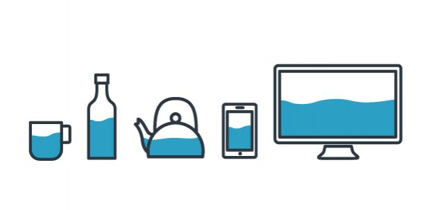
RWD is a web design technique aimed at creating sites that provide a consistent user experience across a wide range of devices and screen sizes. Content, navigation and features should be both accessible and usable, with a minimum of scrolling, panning or zooming regardless of device you use to access them. The basic premise is that the content (written text, images and features) of your site becomes like water.
“Empty your mind, be formless, shapeless — like water. Now you put water in a cup, it becomes the cup; You put water into a bottle it becomes the bottle; You put it in a teapot it becomes the teapot. Now water can flow or it can crash. Be water, my friend.” – Bruce Lee
Responsive web design is also the most efficient technique for making the same code work across multiple screen resolutions.
What does responsive web design mean for Jisc?
- Small, medium, large… A single site for every screen
- Start with user needs, and understand their context of use
- Take a ‘mobile first’ approach to design and content creation
- Stop designing page layouts and start designing the parts that make up those pages
- Choose progressive enhancement over graceful degradation
- Unobtrusive JavaScript
- Use language that is appropriate for both touch and non-touch devices
- Be modular, use design patterns
For further reading check out RESPONSIVE WEB DESIGN by Ethan Marcotte
2 replies on “Responsive web design (RWD)”
Responsive Web Design is about using CSS and HTML to resize, hide, shrink, enlarge, or move the content to make it look good on any screen
Empty your mind, be formless, shapeless — like water. Now you put water in a cup, it becomes the cup; You put water into a bottle it becomes the bottle; You put it in a teapot it becomes the teapot. Now water can flow or it can crash. Be water, my friend.