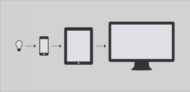
“Day by day, the number of devices, platforms, and browsers that need to work with your site grows. Responsive web design represents a fundamental shift in how we’ll build websites for the decade to come.”- Jeffrey Veen What is responsive web design? RWD is a web design technique aimed at creating sites that provide a […]
Category: Mobile
Designing mobile first
Ever heard comments that have gone something like… “The sort of tasks that users are performing are too complicated for mobile” “Analytics show our primary audience is desktop” “Users only want a desktop site” When desktop use vastly outweighs mobile it seems obvious to prioritise that as the primary medium. And following a strategy that […]
Becoming responsive
From the start, we wanted the new site design to be responsive. It was a no-brainer for us as a busy team to want to maintain one site and one set of content and not have a separate mobile site, as we had done previously. It is also a better experience for the user who […]
We have today launched JISC Mobile, a cut-down version of the JISC website, optimised for mobile use. The site contains recent content that users are likely to want to access whilst on the move, such as news items or podcasts. It doesn’t contain all the content on the JISC website and links are provided on […]